They spent WHAT on a logo?
That’s the first reaction, be it the $20K Fairborn spent, the $25,000 Dayton just spent, or who knows how much UD spent on the infamous “VD logo”
“My kid could have done that” or “have you heard of Fiverr” are the next things out of most people’s mouths.
But, when I’m not writing this blog, making logos is one of the things I do for a living. So, yes, I’m biased, and no, your kid can’t really do it- unless they happen to be incredibly talented, like this guy:
In 26 years of business, I’ve had lots of college trained kids walk in here- who still couldn’t do a good logo. Alan could.
But, the real questions are; do you need a logo, what is a good logo, and how much is it worth.
Why do we have logos, brands, tribal marks? I can show you a multitude of logos, or just pick 2, and you’ll understand.
Paul Rand, one of the masters of graphic design said “… the ideal logo is simple, elegant, economical, flexible, practical and unforgettable.”
That’s a tall order list. If I said the word “swoosh” most of you would think Nike.
Yet, Phil Knight thought that there was no better logo than the 3 stripes of Adidas- because the stripes actually helped make the shoe better. He only paid Carolyn Davidson $35 for the original swoosh logo- and look at it now. (For the record, they came back to her and made up for their original stinginess).
But when you look at the two logos at right, you not only immediately know what the companies are- but, what they stand for. Apple, for sleek design, simplicity, friendly, a knowledge focused company. Harley for rugged individualism. Both brands have their cults- and their logo is their voice and soul. People tattoo these logos on their bodies.
If you want to learn about logos and branding, I always recommend the book “The Brand Gap” by Marty Neumeier.
He explains that a logo is not a brand. That a brand isn’t what you say it is- it’s what THEY say it is. He talks about two important concepts- the “hand test” and the “swap test.”
And, that’s where we come down to why does a city need a logo, what is a great one, and what is the value to a community.
Let me ask you what would Paris be without the Eiffel Tower? London without Big Ben? DC without the Capital, the Washington Monument? And you say those aren’t logos- and you are right- they are icons. Which is what a logo is too, when it’s well designed.
 When it comes to city logos, there are a few that “represent” a city to me.
One really belongs to the Detroit Tigers baseball team- but, when you see that highly stylized D, you know immediately, you’re dealing with a motor city lover. The logo is bigger than the team, it’s the city.
The “I heart NY” logo was a response to the city’s recent bankruptcy, and drop in tourism, as part of an ad campaign by Wells Rich and Greene in 1977. The logo, sketched out in a taxi by Milton Glaser, was actually done pro bono. It helped re-position the city to tourists and became an icon almost instantly. After 9/11 it had an even deeper impact.
All four of the logos I’ve shown as examples of well done graphic design, have been part of merchandise sales in the billions of dollars. People pay extra for a shirt, hat, boots, computer, because of the logo and the brand- and the associative qualities they represent.
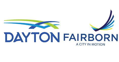
Which brings us around to the Dayton/Fairborn attempts at branding.
I’ll now explain the swap test. If you switch the swishy swooshs above the type- does it make any difference? In “The Brand Gap” Neumeier shows us the Nationwide frame logo that they later abandoned to return to their eagle- and the Polaroid logo. Almost anyone over 50- would think that the Nationwide logo- when replaced with the word Polaroid made more sense- and Polaroids color grid- could go anywhere.
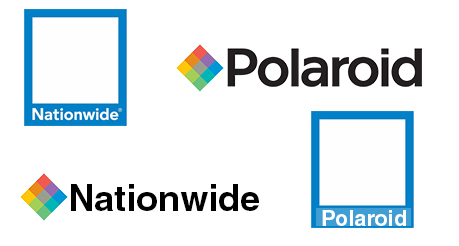
See the graphic to the left. The Polaroid logo in the Nationwide frame makes better sense, to those of us who remember the old Polaroid film.
And that’s why both the Dayton and Fairborn logos lose me immediately.
But, there is more- when you turn those logos into black and white- especially the Fairborn logo- or try to embroider it- they kind of fail.
More colors, means more expensive. Less emphasis on the type- more on the swoshies.
And, again- what are we looking at? Fairborn looks like a bird- which I can almost buy. I actually like it better in one color. Dayton, reminds me of the emblem on an Asics running shoe- sort of. Is there an “A” in it? Hmmmm.
When I look at students portfolios, or even those of journeyman art directors, I look for an ability to make things fit in a more interesting way than I’ve ever seen them before. I look for subtle cues that there is something more than meets the eye.
A classic example of that is the FedEx logo done by Landor and Associates.
Once you see the internal arrow in between the E and the X you get why it’s great.
 Even in black and white, that arrow is still there.
And then there is the “hand test”- take an Apple ad, cover up the logo- and you still know what the ad is for. The product is distinctive, the restraint, even the choice of fonts. There aren’t many brands that can do that. Harley comes close- to most motorcyclists- you can hear a Harley before you need to see one.
Circling back to the local branding exercises. No matter what Fairborn thinks, they are irrelevant. Dayton is where we all live. The little subdivisions and pop-up micro-republics are a joke. As much as I think of Kettering, if anyone had the right idea long ago- and wasn’t driven by racist behavior, Dayton would be all that mattered, as rightly it should. Regionalism is the only thing that’s going to make us relevant- not a logo, not a tagline, not a new office building, interchange, or technology.
The Dayton brand needs a boost- much like NY did. Detroit is bouncing back. Because a good brand, builds pride, gives people something to rally around. For me, I prefer to wear old UD gear that just says DAYTON in the old arch. Not because it’s great, but, it has a certain comfort level- using the standard athletic vernacular. I also have a few Dayton Ohio t-shirts that I like to wear that all look better than what the city just bought.
 While we’ve run our flag up as the birthplace of aviation, I’m thankful to not see the Wright Flyer in the logo. But, when I think of Dayton, I think more of a city of industry, brought forward by devilishly smart iconoclasts who walked to the beat of a different drummer. I think of people who changed the course of so many things- from retail to beer packaging. There is value in our history, and in our friendliness and approach-ability. Although I always hated the “City of Neighbors” logo, there was more there than there is in this new concoction.
As to the price tag, had they spent that at a shop better known for branding, they might have gotten something really good.
Because, this isn’t it.

Were I teaching commercial art, I’d use this post as a textbook.
Tho’ I’d ask you to go back and add the Amazon logo, with the A-Z smile-arrow.
Thank you TRUDDICK.
There are quite a few logos I could have included as examples of excellence.
The old Paul Rand Goodwill logo with the smiling G, his UPS logo with the string around the package, the work Joe Duffy did for Classico which totally transformed the category which had always been red, green and yellow.
The beauty of the script Coca-Cola logo combined with the shape of the bottle.
Designing a logo is a lot more than just picking type, shapes and color, it’s creating an entire story to match the narrative. We have some real graphic design talent in the area- which I highlighted in my UD VD logo post- but, unfortunately, none of these logos were done by those with talent.
As much as I despised the new UD logo when it came out it’s fair to say that it ended up not being a catastrophic mistake. A missed opportunity is all. They basically held serve. The Urge Overkill UD logo was awful and was not legible during TV broadcasts. The new logo is at least legible on tv. You can’t go anywhere in the burbs without seeing folks wearing the new logo and it is very popular with the younger fans. My son even has huge Fathead of the new logo on his bedroom wall.
The suburbs and towns surrounding Dayton are relevant. This isn’t Little House on the Prairie where it’s a big deal that we are heading into Mankato. Technology is making us more and more decentralized. Dayton is just like every other town or suburb in the area and is visited only on occasion. Most of what we need: work, food, entertainment, church etc…is available without having to go into city.