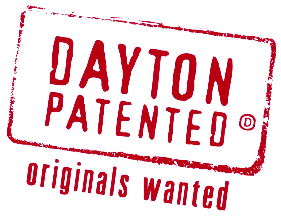
Dayton Patented, Originals Wanted blows “Get Midwest” out of the branding game
Penny Ohlman Neiman owed the City of Dayton a winner after their last branding effort gave us the 4/color (when 4 color printing would still break the bank) stupid “City of Neighbors” mark with the name of the City all catywampus. (update- PON didn’t do the work- they are just implementing it)
Today- they (NorthStar Ideas) hit a grand slam home run, to win the World Series in game 7, in the bottom of the ninth (yeah, Forbes pretty much wrote us off as dead this morning- more on that later).
While I don’t think a second grader could do worse presentation- between the lack of a screen, a dim projector, butt fugly slides, reading the slides- and a piece of water sculpture sounding like some one peeing in the background- the logo and concept they presented made you forget that the A/C wasn’t working either.
In other words the presentation wasn’t exactly made for TV- which in this day and age- huge mistake.
But the logo- hammered the nail into the wood with one mighty stroke.
Yeah, I like it. Get Midwest should be thrown in the dumpster- ’cause this logo/tagline has some meaning.
To be used as a “Rubber Stamp” on all city correspondence, an ad campaign, and even by itself- it speaks to the heritage of innovation of the region, the number of patents per person- and that there is still an opportunity for “originals” to come to Dayton and make their own mark.
Presented to the “Dayton Create” group of catalysts- at the CADC facility in the Cannery, the mark was incredibly well received. Even the old guard- who always ask for the Wright Flyer on everything thought this worked. Better yet, when wearing the t-shirt somewhere outside the region- no one would have to ask “What does “Get Midwest” mean”?
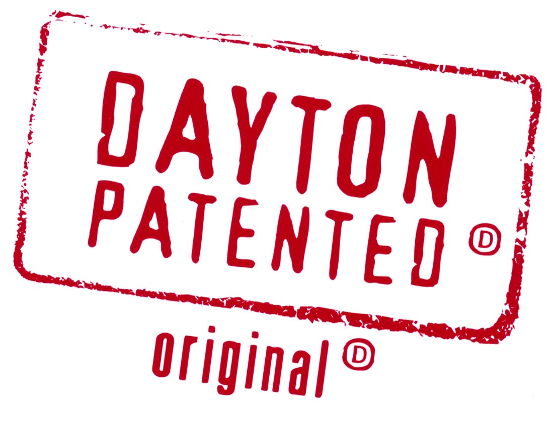
An extension of this brand could be a mark for establishments that are Dayton Originals- like the independent restaurant owners association- could all mark their menus and ads with this version- as well as a Google maps mashup with all the Dayton Patented Originals marked.
The only thing that could have made this new brand better today- would have been passing out rubber stamps for everyone to use- so, for now, you can click on these logos 2x to get a pretty high rez version.
You can read the DDN piece here.
Relevant part:
The city paid Nashville-based, North Star Destination Strategies $95,000 in 2007 to perform the initial research and development of the branding campaign. Dayton-based Penny/Ohlmann/Neiman will handle implementation of the campaign this year at a cost of $50,000. So- to get an original- we had to go to Nashville.
Note- this whole thing cost less than twenty percent of what the Dayton Development Coalition paid Congressman Turner’s wife’s firm ($900K).
- Dayton Patented Original version


David,
I’m a longtime lurker on your site and finally decided to comment today. Don’t ask me why today, I’m just feeling frisky. Anyway, I checked ddn.com a few minutes ago and was so relieved when I read the Dayton Patented article. I immediately jumped to your site to get your take on it. Finally, something positive that was done well by the city. I’m so tired of the usually news that just makes you roll your eyes at the leadership we have here. The whole campaign and positive feelings behind it are like the refreshing evening breeze that is blowing though town tonight at the end of a hot humid August day. Way to go Dayton.
Thanks for your continued honestly David. I don’t always agree with you, but I encourage others to read your blogs and actually think about issues. Keep up the good work.
P.S. Of course DDN chose to put a picture of a new roller coaster in Cincinnati on its site instead of the new logo, but after all, what do you expect?
Liam-
Glad you decided to comment. The comments at the DDN site are running 99.9% negative- fits right in with the very attitude that the campaign is trying to transform.
We’ll see how this plays out after a few weeks, but, it’s at least a step in the right direction.
Actually this looks very up-to-date. I recognize the typeface they are using for the “Dayton Patnetned”, seen it elsewhere, but don’t recall the name.
I really do like this. Simple, elegant, works well, but multiple meanings. Even the little TM “D”.
I like the message, too. Orginals Wanted. Which is in itself an ‘original’ riff on the “Keep _______ Wierd” concept.
The DDN comments section? DDN Comments: Conformists Wanted.
Where do I get a T-shirt?…I’m Dayton OG! Biotch!
This looks a little life false patent marking. The ordinary person seeing this mark o. A product would be confused into thinking the product being patented.