Full disclosure: I have worked in branding and design for over 27 years, winning awards for logos, branding and naming companies and products. My firm, The Next Wave, had approached the University of Dayton Athletics Department about doing tactical advertising- getting butts in seats, for the UD Women’s team while this new “branding effort” was in motion. We were rebuffed by a mid-level bureaucrat. I wouldn’t have recommended changing the brand mark as a critical component of their advertising and marketing strategy at this point- being that it’s incredibly expensive, and that the existing brand just got a huge bump in exposure on the national level. You can see examples of my firm’s work: http://thenextwave.biz/portfolio-page/brand-marks/ [1]
The feedback on the “new and improved” University of Dayton athletics brand has been almost universally negative on social media. And while the old brand may seem dated, there are always ways to subtly update a brandmark without throwing the baby out with the bathwater. Retro hipster looks can be very in these days- an entire industry has been born in selling classic brand apparel – meet Homage [2] in Columbus. Or the “Original Retro Brand” [3] with old Negro League merch.
If you want to learn the story of Homage, you can watch this amazingly compelling and beautifully shot and edited story by a Dayton talent, Showdown Visual [4], run by Kenny Mosher, [5]who happens to be a UD grad, with a BA, in Photography, Music Technology, Computer Engineering
The explanation, for the new branding in the press release, where the agency in Philly feels that its name is as important as the client’s-
On the heels of a remarkably successful men’s basketball season, the University of Dayton is rolling out a new logo and identity for the Dayton Flyers athletics program. Produced by branding agency 160over90 [6], with creative consultation from Nike, the athletics logo was revealed on Friday, July 18, on the Dayton Flyers website.
via University of Dayton : News : Athletics Reveals New Image, Logo [7].
Reminds me of some other amazingly egotistical designers, and one in particular- Peter Arnell- who was responsible for one of the biggest rebranding flops in history for the Tropicana division of Pepsi. You can read more about it and watch a video in this post on my company blog:Redesigning Brands isn’t always the answer [8] Pepsico pulled the plug on the relaunch in 5 months after sales plummeted.
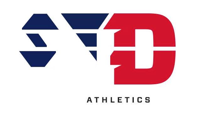
The most common responses on social media are “Where’s the U” and it “looks like VD” which are both very relevant comments. In my circles, there are some locals who believe they could have done a better job. I’m going to introduce you to six firms that would have been better choices- and not in any ranked order:
- Real Art: [9] Headed by another UD alum- Chris Wire (who is one class shy of graduation), already has a relationship with UD Athletics. That amazing player introduction video is done by them each year- with the filming of new players- and all the cool motion effects added. With offices in NYC and Chicago, they aren’t exactly local yokels. Very talented folks.
- Graphica [10]: The granddaddy of Dayton design. This firm has consistently done amazing work for almost 30 years. A very stable organization, many of their people have worked there from the start. They’ve done branding for companies like NexisLexis and have worked with Nike for years.
- ZeDesign [11]: While they now specialize in graphic treatments for athletic facilities- including UD Arena’s makeover a few years ago, they have the talent to do an update in a heartbeat.
- Hucklebuck Studio [12]: Located in Springfield, Andy Hayes is a world class talent. I’ve never met him (something I hope to rectify soon) he does work for national brands.
- Tim Frame: [13] a professor at Cedarville and a really nice guy, Tim has been in the business a little longer than I have, and I’ve yet to see something other than awesome out of him.
- Rickabaugh Graphics [14]: Columbus designer Eric Rickabaugh has mad design talent, but currently his site is under construction. Another old timer, I called on him in the early 80’s when I worked for Graphica. He’s a really nice guy and was responsible for the rebranding of The Ohio State University, which then launched his career into mostly university identity systems. (update- I forgot- he did the last update- which was also hated then)
For future reference, I maintain a list of all the ad agencies and graphic design firms in Dayton, Columbus and Cincinnati. [15]
Coming back to the “New and Improved” UD athletics mark- I’m uninspired by it as a stand-alone mark, I don’t particularly like the ligatures [16] on the logotype (ligatures are connections of letters usually done to save space (ff and tt almost always get the treatment as do fi) and to make it easier to read- they are usually done only on lower case letters or on particular upper/lower combinations like Fi). Connecting the Y and T in Dayton to me is almost criminal in a non-italic all caps execution- there is no need.
On the uniforms, the new marks look OK- remember, these are almost always in motion anyway. On the court- this thing looks like an abomination. If a logo needs explaining, it usually is a #FAIL in my book. The most common comments are it looks like “VD” and “Where’s the U” – to answer that- I made a quick down-and-dirty graphic to explain this mess.
 [17]
[17]Click on image for a downloadable PDF
Here is the link for the PDF: UDayton deconstructed pdf [17] Feel free to share.
Why the “University of Dayton” uses an agency in Philadelphia should be a major question for the alumni association that paid for this work. I also wasn’t impressed with the great freshman bike giveaway [18] that this agency turned into a 15 second media sensation- where the university pledged to give away 100 $600 bicycles to kids who are enrolling in a very expensive school. I thought the money would have been better spent on extending the upcoming Dayton Bikeshare system [19] to campus. To me- it was like a bank giving away toasters- and those days are long over.
UD athletics has an unbelievable fan following, and I doubt people will give up their season tickets over this. But, I’m sure the jokes about this new logo won’t stop- “We are V-D, Clap, Clap”
Share your thoughts.
Here is a mark for the haters to use:
How to just say no to VD for UD.
Yep, it reads “VD”.
Relative to the quality of the education offered, UD is crazy expensive. The cost/benefit ratio seems way off, at least to me.
With all of that money they gouge out of kids and their parents, you’d think they could hire somebody to explain to them why this is a bad logo. It really does read “VD”, no doubt about it.
Geez……this is Dayton’s flagship university? Pathetic.
VD…! Does a LOSER LOGO translate into LOSER CITY, LOSER TEAM, LOSER SCHOOL , LOSER FACULTY and LOSER DEGREE? With an STD now THE primary image to become firmly implanted in the subconscious minds of all who are exposed to this VD logo, it is a pathetic construct representing an exceptionally poor decision by obviously unqualified decision-makers who have major failures as to their own powers of perception and basic common sense. Wasted money for sure, so now we know that there really is excess money to waste at VD. VD will now surely become the laughing stock of the Internet and television networks. -Dr. Kent 19 July 2014
Honestly, the logo looks like something Michael Scott would have approved in an episode of THE OFFICE.
It is Dr. Kent that gets what UD/VD is all about and explains it perfectly. He took the words out of my mouth.
There is a petition on Change.org: http://www.change.org/petitions/university-of-dayton-athletics-please-bring-back-the-u?recruiter=128866380&utm_source=share_petition&utm_medium=facebook&utm_campaign=share_facebook_mobile
Please sign.
As a UD Alum and graphic designer, I agree wholeheartedly with the assessment of the logo. I also studied journalism while at UD. That being said, using a hash tag in an article, such as your use of “#FAIL,” makes you appear to be a a pretentious teenager. The hash tag has no place outside of the realm of social media. People should not be using it in everyday speech or, god forbid, a professional assessment of another person’s work. As Weird Al would say, that’s a “Word Crime.”
1) First off, it has become quite popular for populist logo critique on the internet. Everyone can have opinions on new logos, designs, etc, but when people—especially people not versed in the particular field—make definitive remarks about the successfulness of a logo design, I immediately start rolling my eyes. 2) This writer seems to try to assert himself as a sort of expert on branding and logo design (27 years as a designer and all), yet after looking at his portfolio and observing his lack of understanding (or caring) about proper typography (the guy has no idea how to use hyphens and dashes in writing) in his post, I’m hesitant to recommend his opinion as authoritative. 3) “It looks like a V” a common opinion in regards to the blue wing on the logomark. I honestly didn’t think that until people brought it up. Can I see it now? Sure. But is it really a V? I don’t know. Just because there’s a diagonal line somewhere doesn’t automatically make something a v. 4) Even more strange is the “WHERE’S THE U?!” argument. Like, please point out to me the U in the Ohio State logo. I mean, “How am I supposed to know Ohio State is a university if it doesn’t have a U in the logo” is not a question that has ever been asked. 5) Are there great designers in Dayton? Absolutely. Can a designer firm outside of a city create successful branding for another city. YUP. Happens all the time. Can a design firm within a city create horrible branding for its own city? Also, yes. In short: Critiquing the logo and critiquing the choice to use outside help are two unrelated things that are being thrown in together. Really what it comes down to is the fact that UD is very close to the hearts of UD alumni and the Dayton community. I think this design is much cleaner, simpler, and vastly improved from the previous design. But any major change for something people hold dear often stirs up a lot of negativity. I think people… Read more »
It obviously reads VD.
It’s a bad logo, unless the organization represented by the logo has something to do with venereal diseases.
@Brendan: This is social media #jerkwad.
And if “Nick” Lacke above had any balls- he would have linked to his logo work: http://nicklacke.com/id.html
but I think the number of thumbs down on his snide comments say it all.
I have no problem comparing my work to anybody elses.
There are probably urologists and other doctors that specialize in treating venereal diseases, and even THEY probably don’t have a logo with the letters “VD” up front and prominent.
It took some searching, but I found a worse logo concept that UD’s latest effort:
http://www.vice.com/read/a-step-by-step-guide-to-rehabilitating-the-swastika-714
From around the web:
“As a Xavier fan, I love the new logo! The epic failure that is the new logo really encapsulates all that dayton is and ever will be.
When the logo was revealed, my husband sent his friend (who is a ud grad) a text that just said “Dude”. Friend’s response “Just don’t. Have compassion. Thanking God we don’t have to play at Cintas, see the presidents and hear “You are VD”. Gives the Red Scare a whole new meaning.”
http://www.xavierhoops.com/showthread.php?28383-New-UD-logo&s=f5134726de9eac6a21c76c2ba679130d&p=456480&viewfull=1#post456480
And then- there is rumor that the AD caved:
http://udpride.com/forums/showpost.php?s=15fa59fec6e92680c0dba40916ab3b0f&p=363242&postcount=412
“Just heard that Wabler caved under intense pressure from upset Alumns.
He admitted they missed the V in the logo originally – but now that it is pointed out he says the logo must go.
They are now going with the logo choice that was the number 2 finisher from 160over90
And he assures us there is no way anyone will confuse this one with initials VD.
Below is that new logo.”
Now I’m just confused.
Is it IUD ATHLETICS?
That can’t be right…?
Now it looks like STD…….
LOL. What a train wreck. I will not be rushing out to purchase any new hats or shirts with the new logo. I guess I need to take extra good care of my old stuff. I never thought I’d say Long Live the “Urge Overkill” UD logo!!!
Apologies if my comments came off as snide, but I just found your post a little too authoritative. I think my other points are still very valid and I assumed as a fellow designer that you are used to the sort of design critique I provided. Certainly, I did not engage in any sort of personal attack—like your attack of my courage/masculinity/number of testicles.
Shows a lot of character trying to get into a pissing contest with anyone who says anything negative about your article. #Fail
One thing I did notice in most of the teams that were in the sweet 16 this year was, most dont have a U in their logos. But then again, most are really big name schools.
@Nick Lacke- “This writer seems to try to assert himself as a sort of expert on branding and logo design (27 years as a designer and all), yet after looking at his portfolio and observing his lack of understanding (or caring) about proper typography” I taught in the UD design program before you were in first grade. I don’t have student “pro-bono” projects in my portfolio. And, I’ve got a few awards around here and a business that’s been doing branding for 24 years- I’ve left more identity projects off my website that you’ve even thought about doing. You had the opportunity, twice, to put your url in and build a back link to your site. You didn’t. And- I’ve been doing this blog since 2005- I’ve heard it all. I don’t try to be PC, I don’t hedge my bets and I don’t worry about pissing people off. I do it to make people think. As to RN’s comment- yep- the part about “University” or “College” in the brand is an issue- but when you name your school after a city or a state- you have to clarify- note the confusion between Ohio University and Ohio State- or, excuse me- The Ohio State University. The problem with this whole thing- and yes- I agree, in 1 color- this mark isn’t near as bad- but in 2 colors it looks like VD everytime- is that that we, the fans, the people in Dayton- don’t call it Dayton. We call it either “University of Dayton”- to clarify it from the “City of Dayton”- one of which is loved and respected- and the other…. well, or we call it “UD.” The brand geniuses in Philadelphia don’t have a Philadelphia University- so they don’t get that. They also don’t go to games much- where “WE ARE, UD!” is a pretty common cheer. Ditching the U- because ESPN calls us Dayton- or some radio guy from out of town calls us Dayton- when there are only 2 teams playing- is not being well accepted by the tens of thousands of UD fans- who aren’t… Read more »
Does anybody keep a list of local fiascos? Here’s a start:
1) The entire Inventing Flight mess
2) The Downtown Dayton Revival
3) The DAYTON PATENTED ORIGINALS WANTED logo
4) The Arcade
5) NCR moves
6) Dayton population at lowest since 1920s
7) Dayton makes Forbes TOP 10 FASTEST SHRINKING CITIES LIST
8) City Folk folds
9) Reynolds and Reynolds relocates HQ to ‘burbs
10) The Wayne Ave. land purchase.
This list is not all-inclusive. Nor is it meant to shame Dayton or Daytonians. I just think that this community and it’s leaders have spent an awful lot of time, money, and energy on some really, really bad ideas. No community bats 1000, but it seems to me that the local success stories (and there are many) occur in spite of the dysfunctional local power structure.
I’m not sure the UD logo tomfoolery makes the above list, but it is a fiasco. Fairly entertaining, too.
I agree with Mr. Leitzell. The replacement logo is also a poor choice. I vote for a very distinctive “D”, that letter standing alone, in solid red. Whether anyone likes it or not, our city and that university are one and the same in the subconscious minds of sport fans elsewhere, which is not a bad thing. Of course, some people could care less about either one. I confess that my loyalty is to Dayton, The City and to Miami University, Oxford, the latter being a Public Ivy…don’t you see. The MU Oxford campus was once deemed to be the second most beautiful in America. I gave up “Redskins” for “RedHawks”, regrettably, but heh, always go with history. I still have the big red “M”.
-Dr. Kent 21 July ’14
No one has mentioned the elephant in the room: Dr Curran’s son works for the Philly branding agency.
I think there is enough cronyism and favoritism in our nation right now. Nepotism at our Catholic University is simply inexcusable.
@George Theilen- you seem to have missed this post from last week: http://esrati.com/in-the-proud-dayton-tradition-nepotism-explains-a-lot/11133/
[…] University of Dayton: We Love VD logo! – Esrati2014. 7. 19. – The feedback on the “new and improved” University of Dayton athletics brand has been almost universally negative on social media. And while …http://esrati.com/university-of-dayton-we-love-vd-logo/11112/ […]
[…] Fun fact: This summer, months after receiving national exposure from the team’s run in the NCAA tournament, the athletic department rolled out a new logo (above, although I haven’t been able to figure out what colors the university wants to use in it). It seems to be unpopular, partly because it now looks like it says “VD”. […]
I never saw “VD” until reading this post; but I still hate that ‘new’ logo, just the same.
You (or any of the local firms you mentioned) would’ve done a much better job.
At least it’s a flat design without any drop shadow…
Welcome to the conversation former intern! Hope you are doing well!
[…] for which they went to Florida to find the talent to help rebrand them (sounds painfully like the University of Dayton going to Philly for their sports rebrand which flopped originally). This week- the chuck the work in the trash can. You can see the UD link for my list of curated […]
[…] The University of Dayton went to Philly for their athletics rebrand- resulting in the infamous ̶… […]
[…] That’s the first reaction, be it the $20K Fairborn spent, the $25,000 Dayton just spent, or who knows how much UD spent on the infamous “VD logo” […]
This article is really fucking dumb…. NEXT