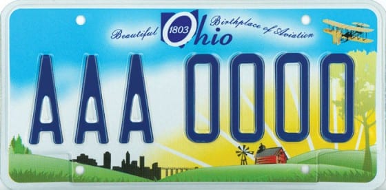
If I gave crayons to a ten year old, I’d probably end up with a better looking license plate than the new “Beautiful Ohio” plate design that I just saw for the first time this afternoon.
Not only is it busy beyond belief- but the text is unreadable- and even the State name is difficult to read.
If we’re looking to be viewed as a forward thinking high tech State- would a wind turbine and a solar roof be more appropriate? Never mind the Wright Flyer has nothing to do with our industrial base or skill set.
There has already been blowback about the attempt to sell these plates for a $2.50 premium in tough times [2].
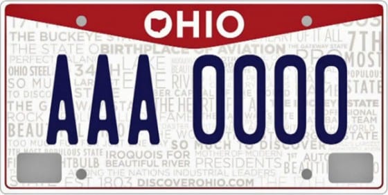
What bothers me most is that Ohio has recently completed a new branding campaign with a very modern, clean look:
This is legible and looks professional, It’s also only 3 colors- making it less expensive to produce.
Why it’s not an option to put on our plates is a mystery to me- we’ve got plates for almost everything else.
What is your opinion of the new plates- and the State tagline and new mark?
Are we the “State of Perfect Balance” (except for our budget). Or we’re we better off as “The heart of it all”?
Either way- I prefer the new O logo to anything I’ve seen in the past.
UPDATE: November 2011, Columbus College of Art and Design students have redesigned the Ohio plates- I’ll finally be asking for new ones next year>


So happy that CCAD got the chance to do this! It’s my Alma Mater!
My personal opinion would be to remove all of the words in the background and go with the red triangle, but I’m sure there were lots of compromises along the way. And I’m sure they won’t be all that visible in reality. I hope to see all of the proposed concepts on CCAD’s website soon.
Happy day to me! I’m excited to get new plates for the first time.
The CCAD plate rocks! Thanks CCAD! The farm tag is proof that Governor’s and their wives should stay out of the licence plate design business.
It’s a plate, you pay on them annually or bi annually. I could care less what they look like, as long as I can drive. The state should worry less about aesthetics and more about what really needs to be dealt with. Now this new governor is going to stick his nose into redesigning the driver license……once again, all over color. I renew my license every four years and barely have it outside of my wallet. Hmm, I guess I don’t constantly stare at it enough to get upset. How much money will go into that? Just like the beautiful Ohio plates, more money down the drain. Maybe we should have designer plates….or not. The person who posted before this was right, governors and their wives need to keep their noses out of license plate and driver license design.
Here’s our new slogan;
“OHIO – OUR LICENSE PLATE LOOKS LIKE AN ENVELOPE”
It’s 2024 and I just got a new truck. I have some very strong words for this ugly thrift store disaster of a painting on the new Ohio license plate, I now have to be seen driving with. Why are we wasting money for this, with more colors more cost. Why get rid of old normal looking plates? If after just 1 year old plates ‘fall out of the system’ according to bmv, instead of 2 years and replace with a simple new sticker. It took me a year long plus to decide on what I wanted to purchase, missing the cut off by a mere 6 weeks The lady who ever, should stick to what ever she does best cause it isn’t this. A hideous disgrace and an embarrassment. I see this plate on every jalopy in town and this awful thing belongs on some $500 dollar car, not on a $50-$60-$70 thousand dollar or more vehicle. Anyone with any class would not want to be seen driving around with this. You failed Ohio! For a little extra money I tried to get something different a more basic wildlife something with a cardinal, but I’ll still be stuck with that awful watercolor or crayon blue. We’ll see.